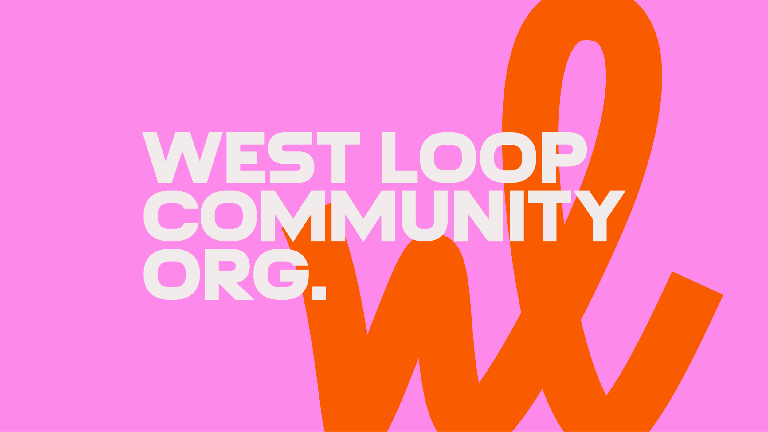
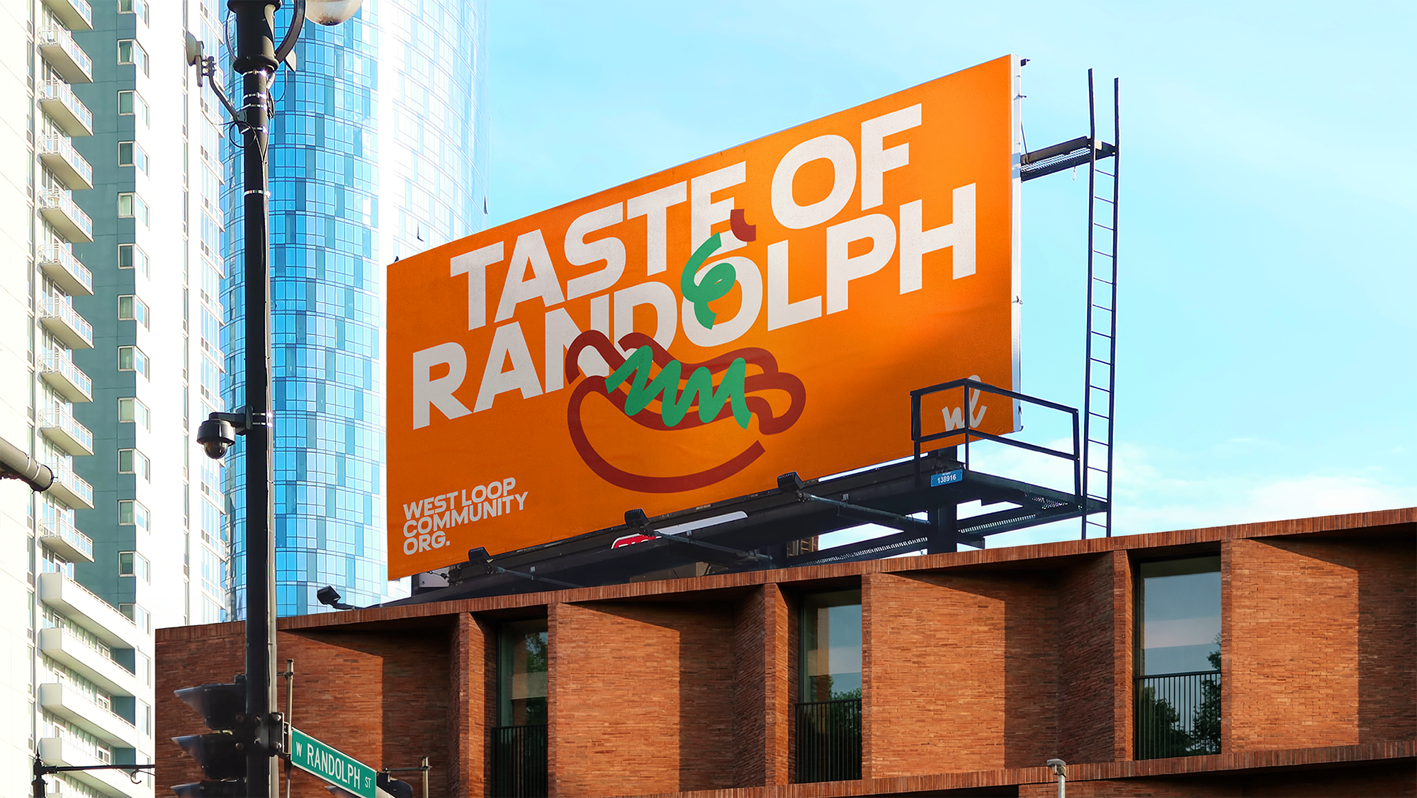
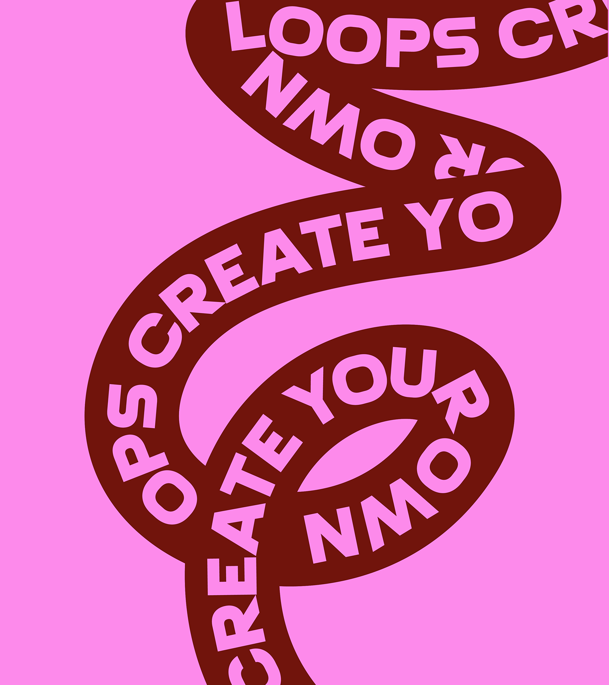
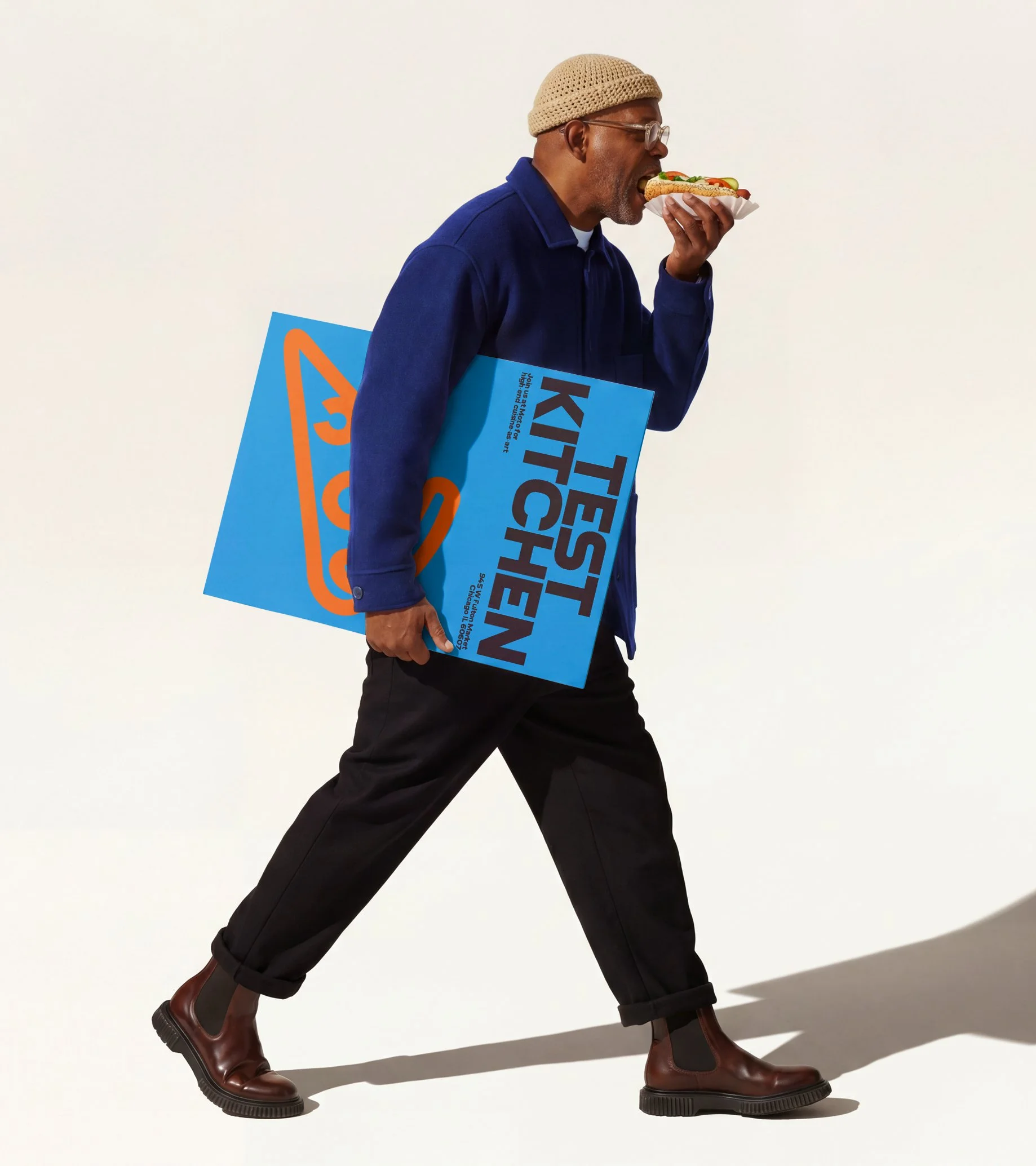
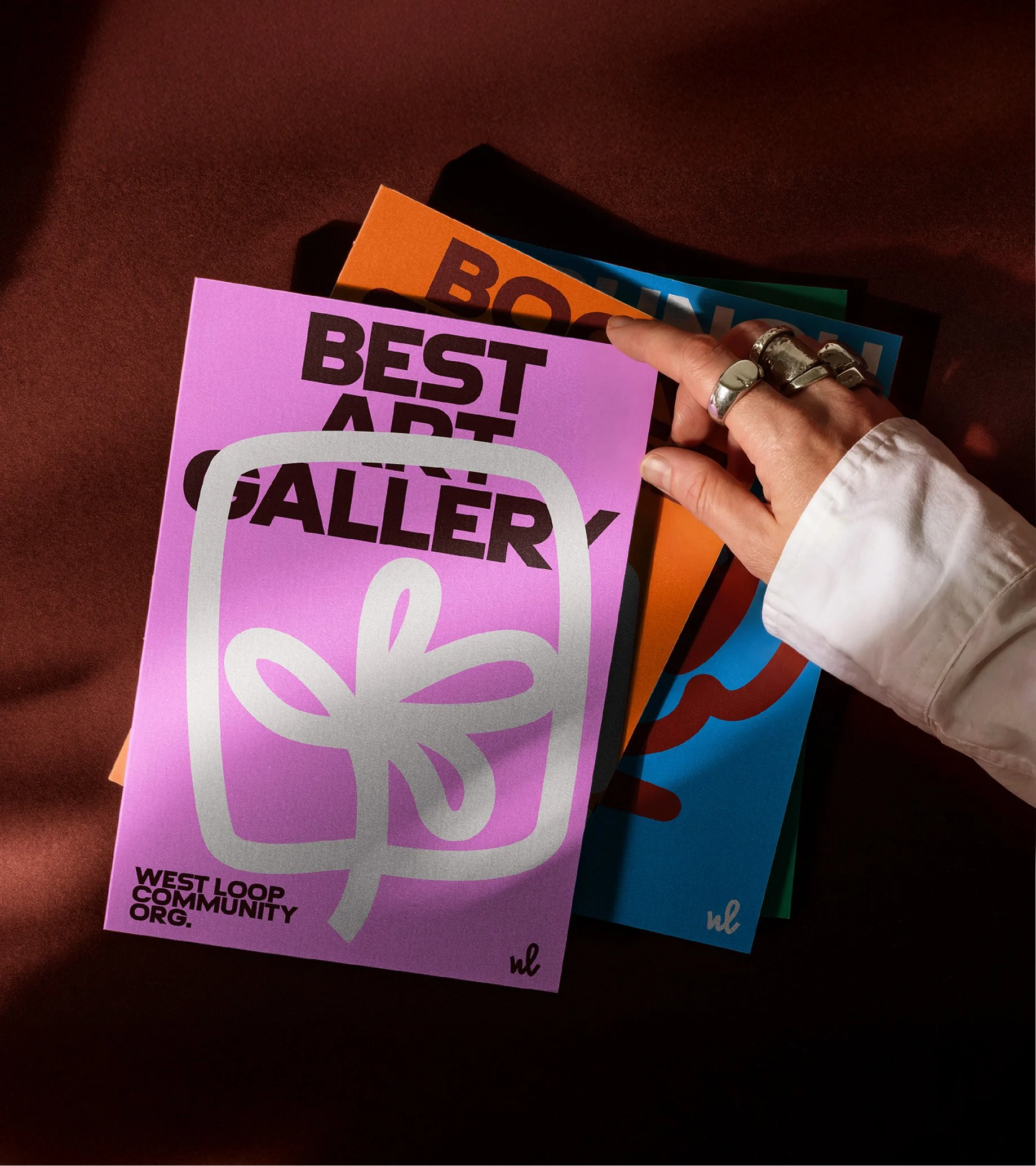
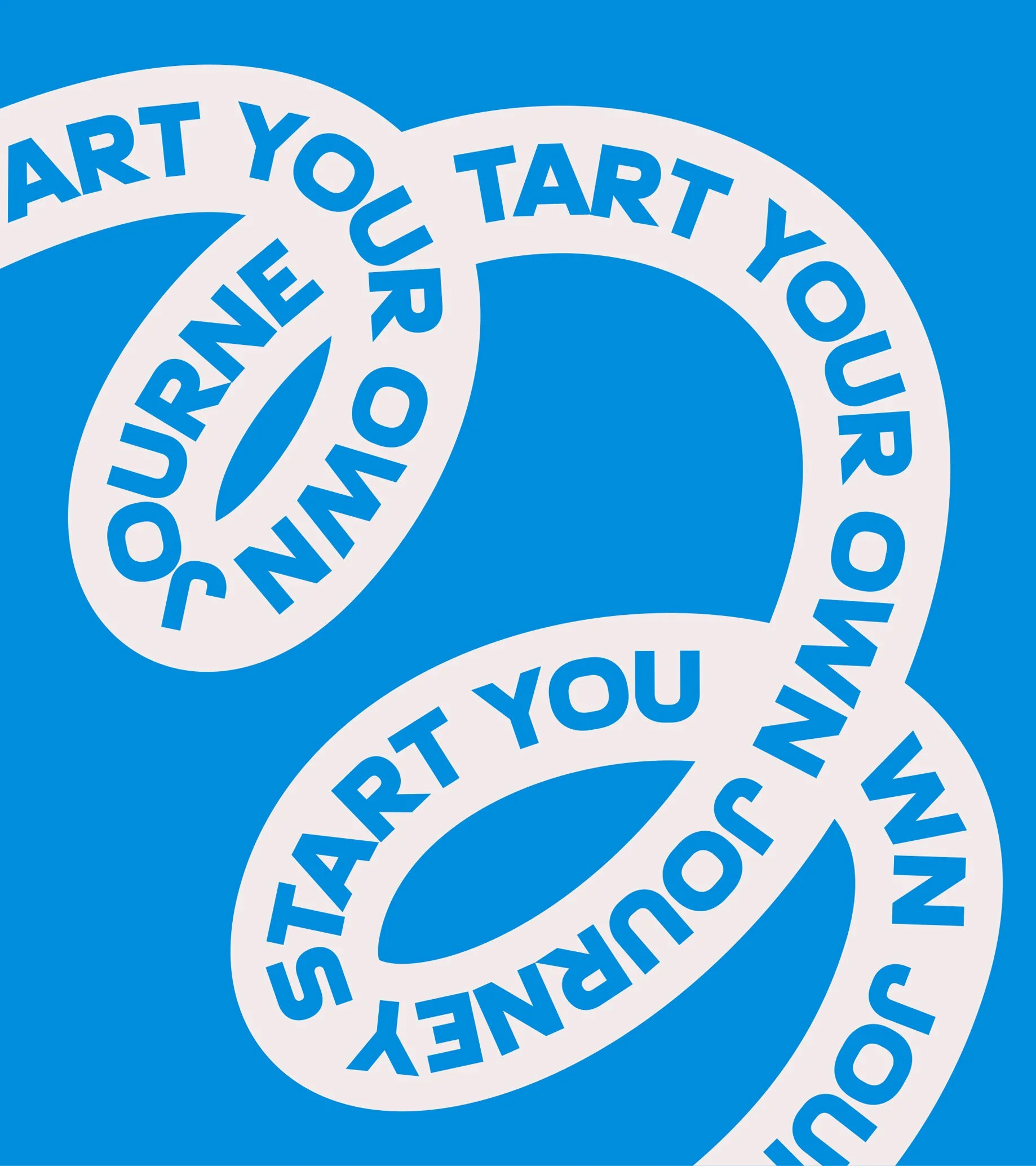
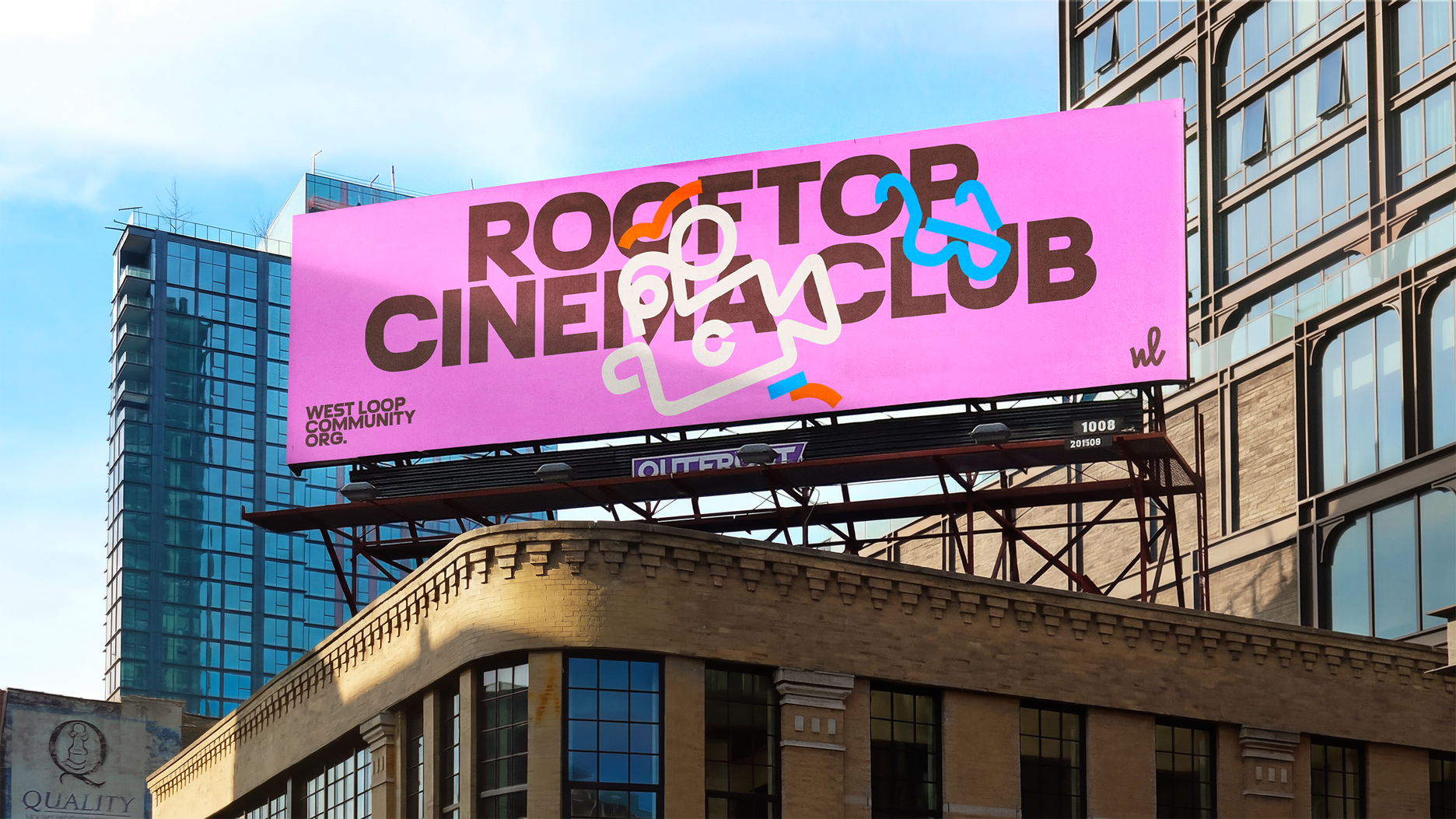
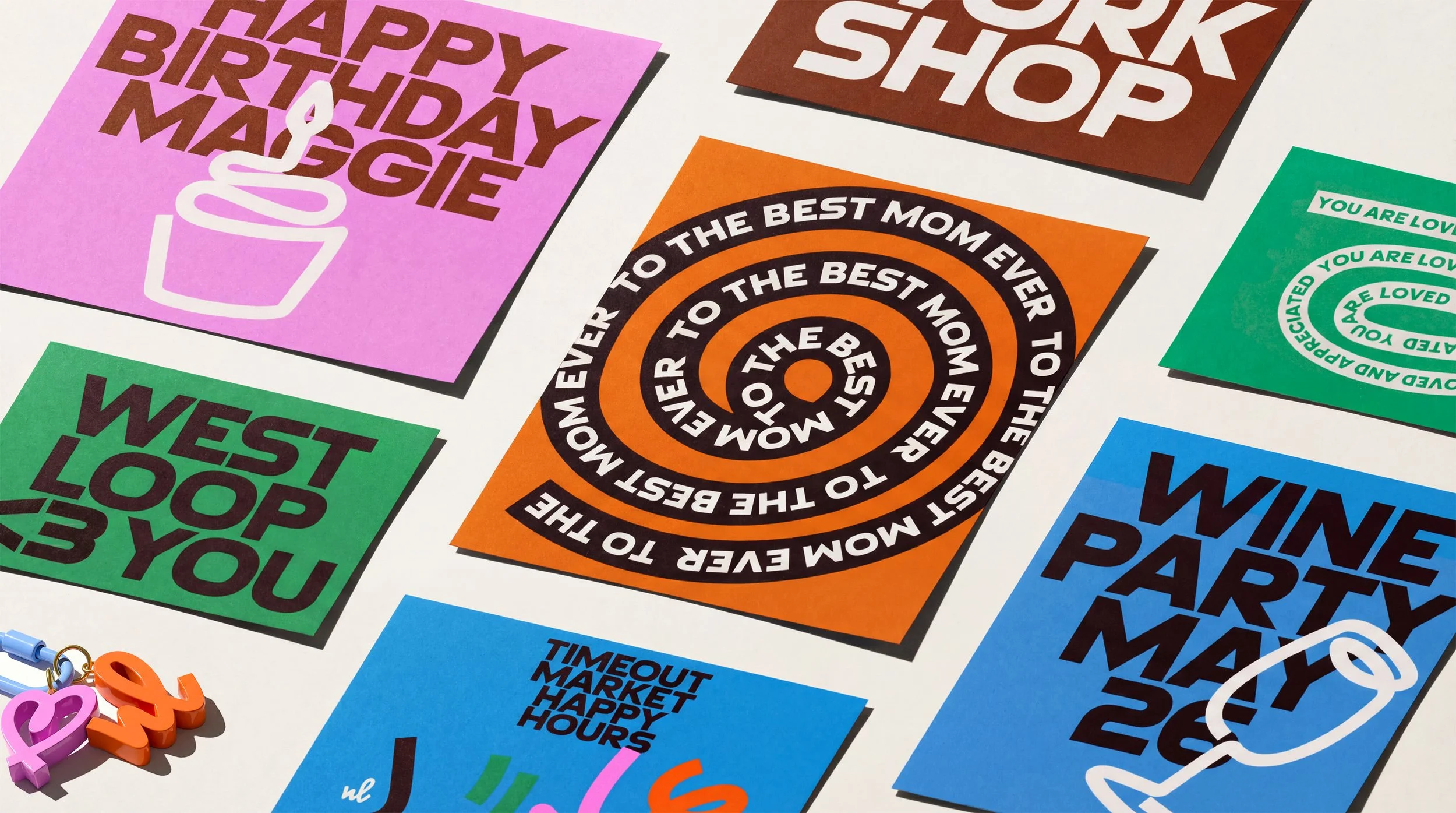
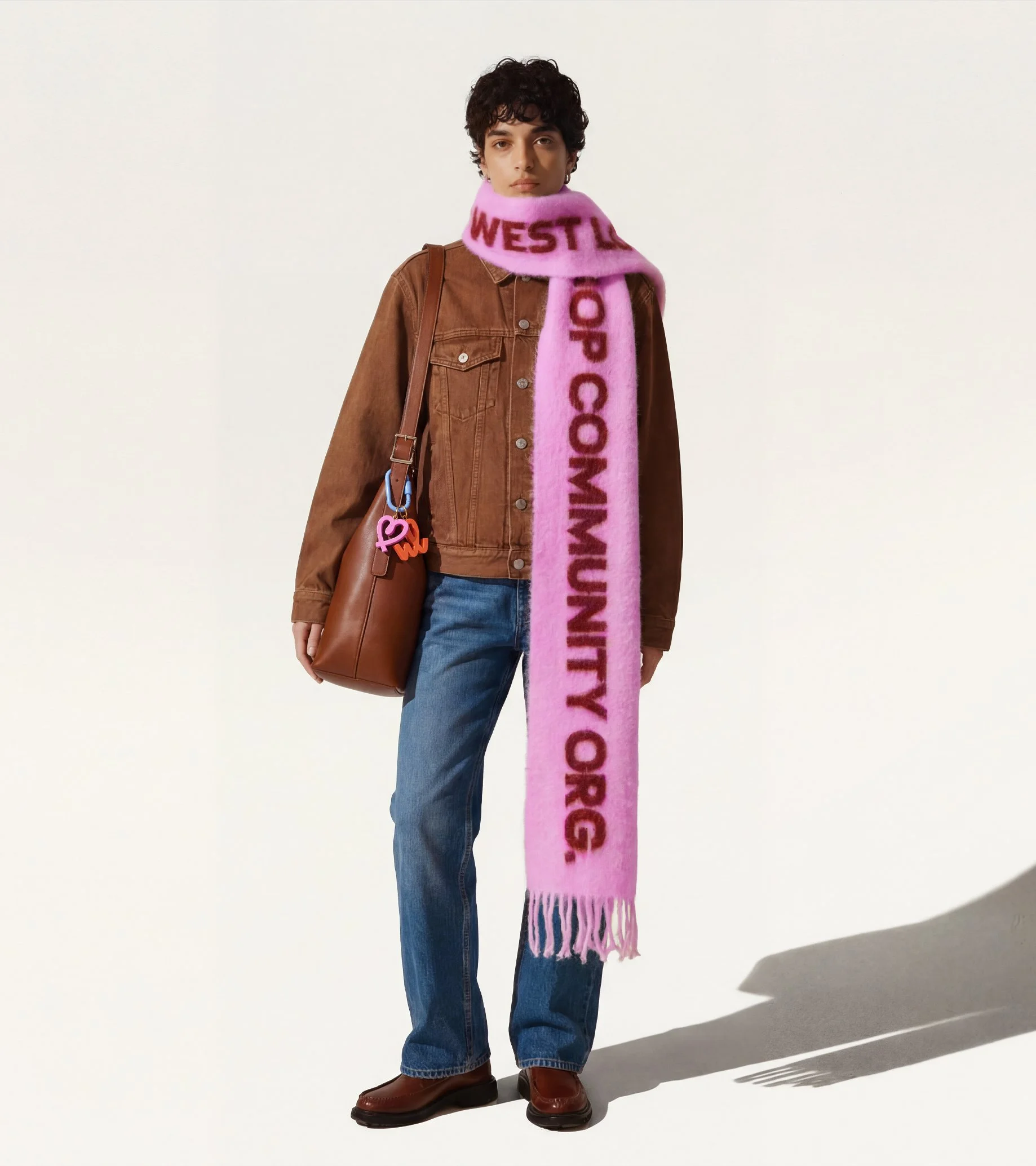
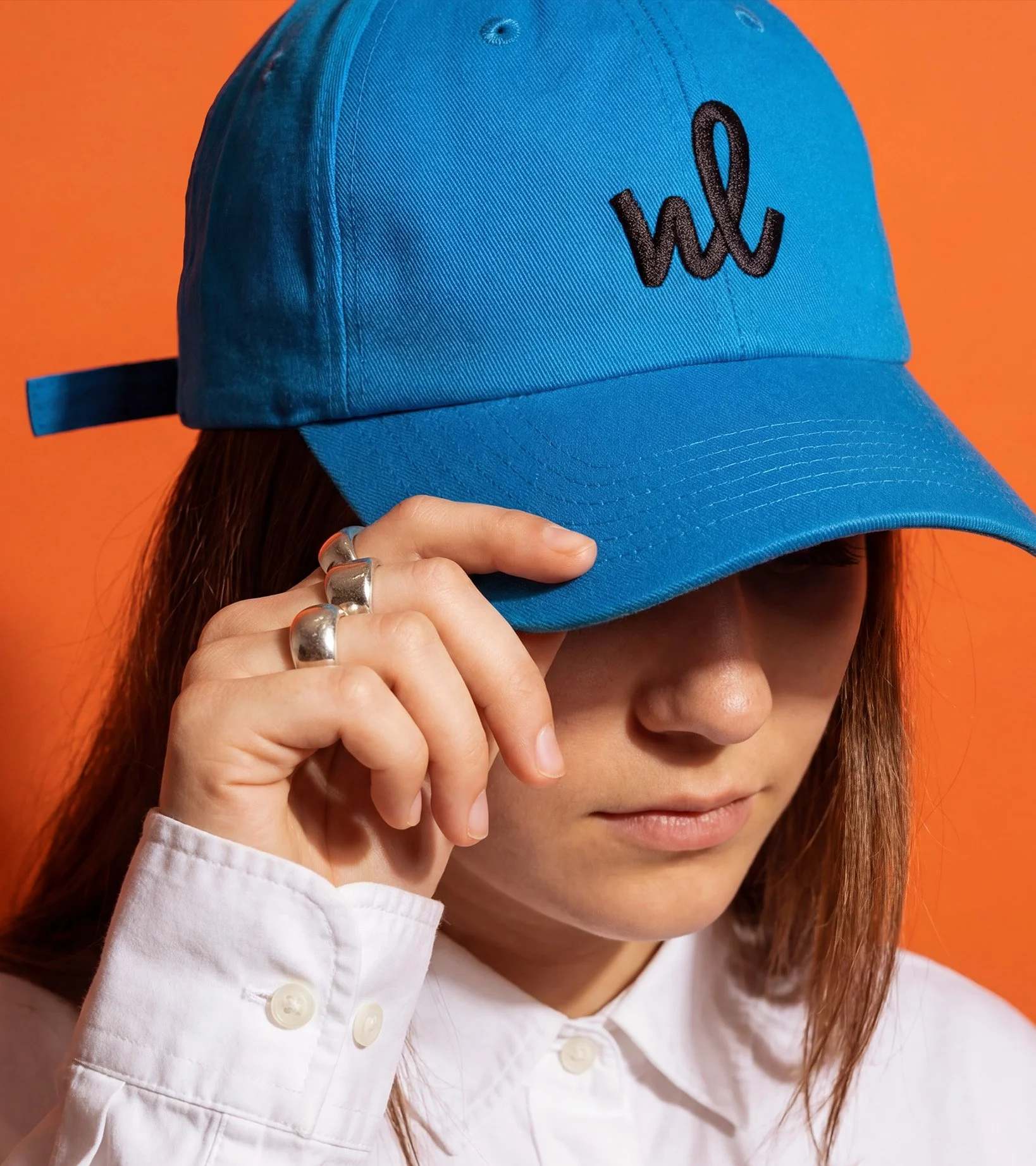
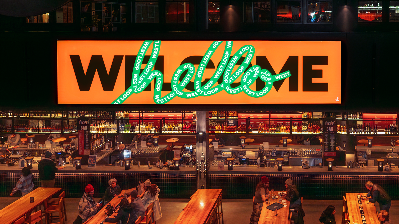
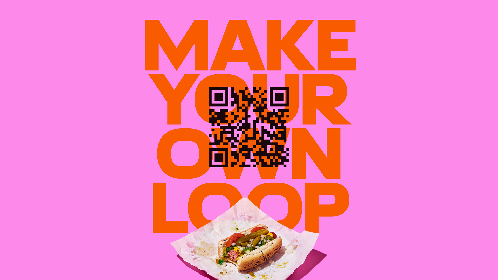
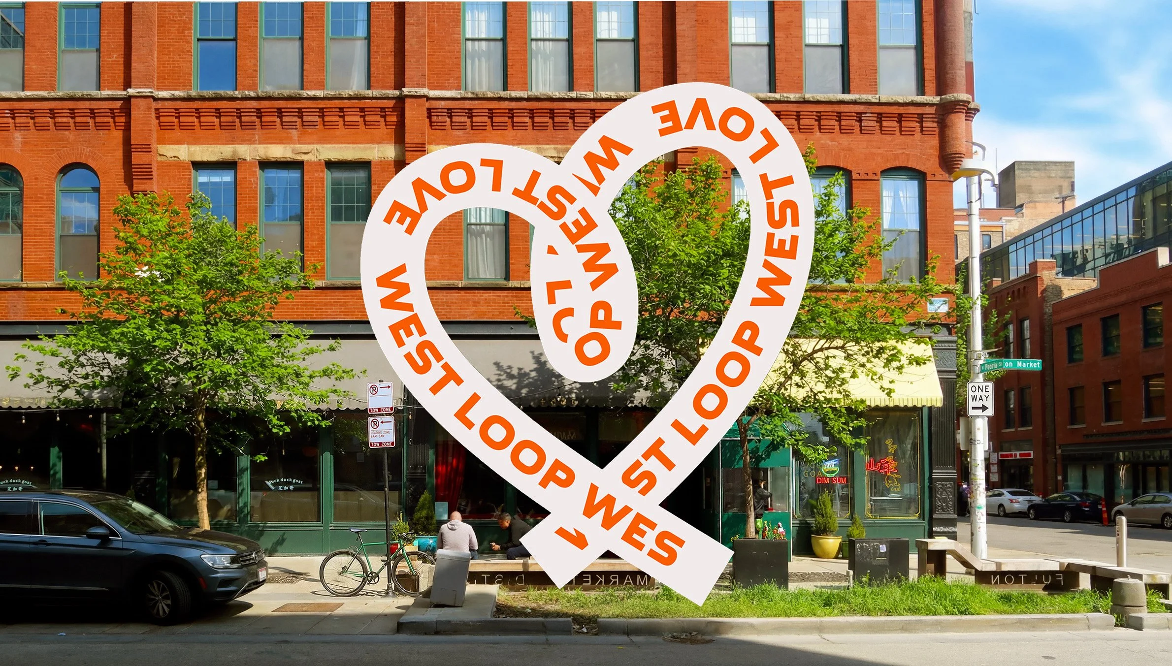
We rebranded West Loop to capture its rapid transformation while honoring its storied past. Our concept, “Into the Loop,” celebrates the unique journeys of everyone who lives, works, or visits the neighborhood, connecting their individual stories into a shared community identity. The result is a fresh, inclusive brand that unites longtime locals and newcomers as West Loop continues to evolve.

Landor, 2024

Client: West Loop Community Organization
Creative Direction: Jeremie Barry, Luke Melloy
Motion and Coding: Thijs de Jong
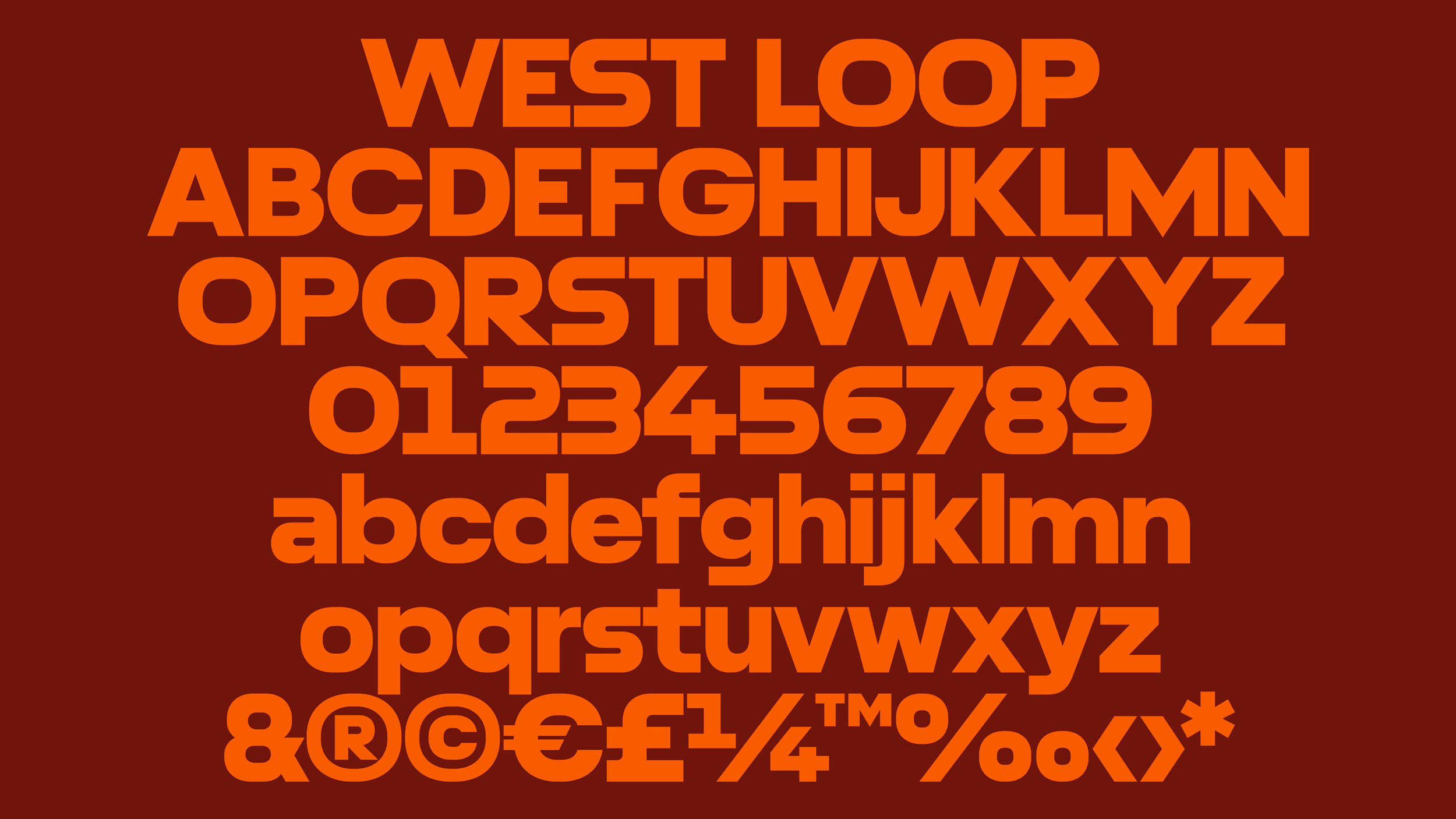
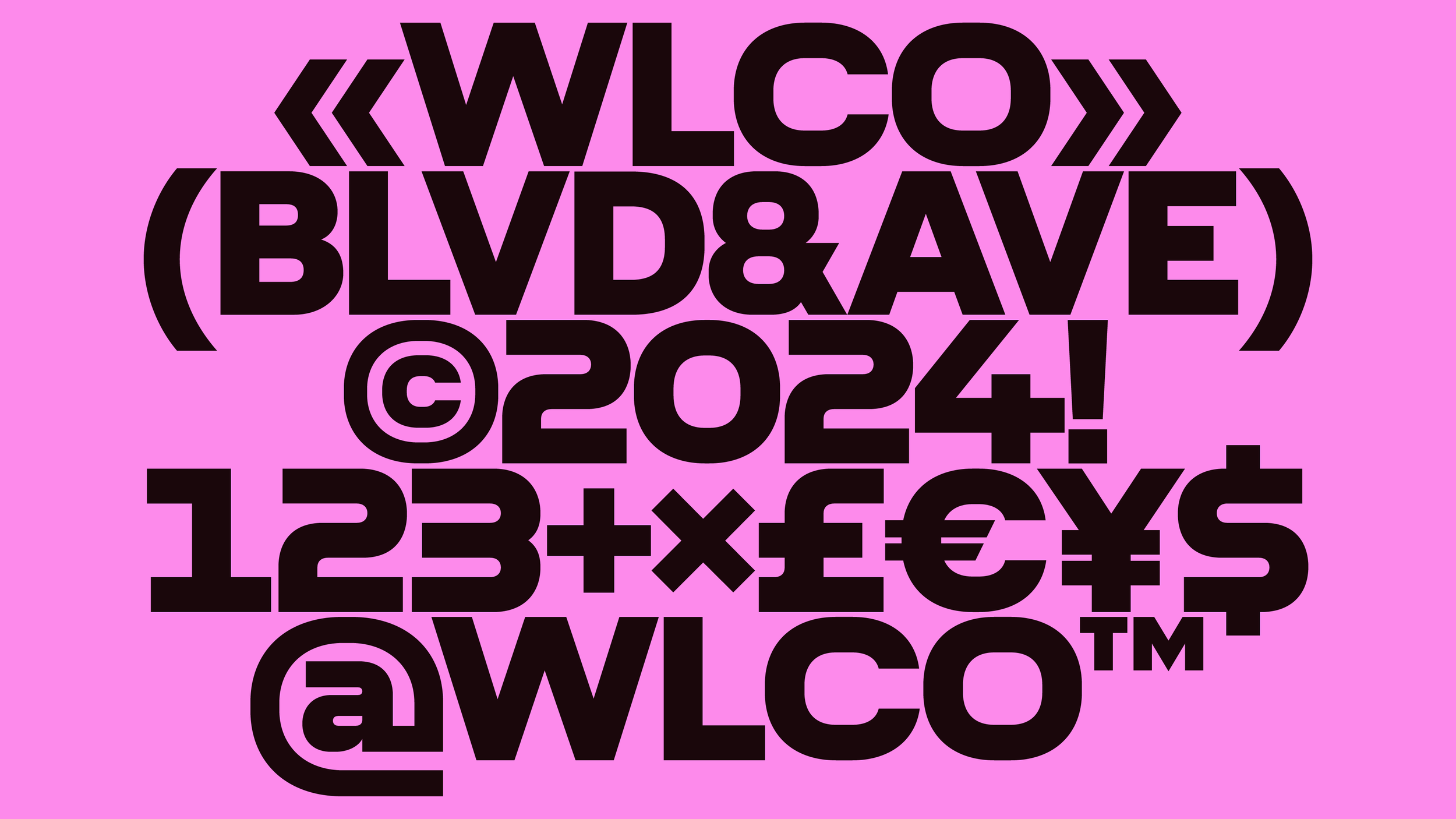
Type Design: Gianluca Ciancaglini
Design & Case Study: Jack Hoac

The design incorporates individual motion loops with unique colors that reflect the heritage of Chicago’s Meat Packing District, such as subway map colors, old bricks, new bricks and cast-iron buildings.

The typography for the West Loop identity draws directly from the neighborhood’s industrial heritage. Inspired by vintage warehouse signage, the letterforms adopt a square, robust structure that echoes the utilitarian lettering once found on brick facades, cast-iron buildings, and factory doors. This geometric character not only reflects the district’s gritty past but also bridges it to a contemporary context, honoring the neighborhood’s history while giving the brand a bold, modern voice.

We developed an interactive loop generator that invites anyone, from local businesses to residents, to create their own loops. This digital tool makes the brand truly participatory, enabling users to design custom graphics, promotional posters, or personal artworks using the colorful motion loops at the heart of the identity.